Acuity Advisors
Brand & Digital Design
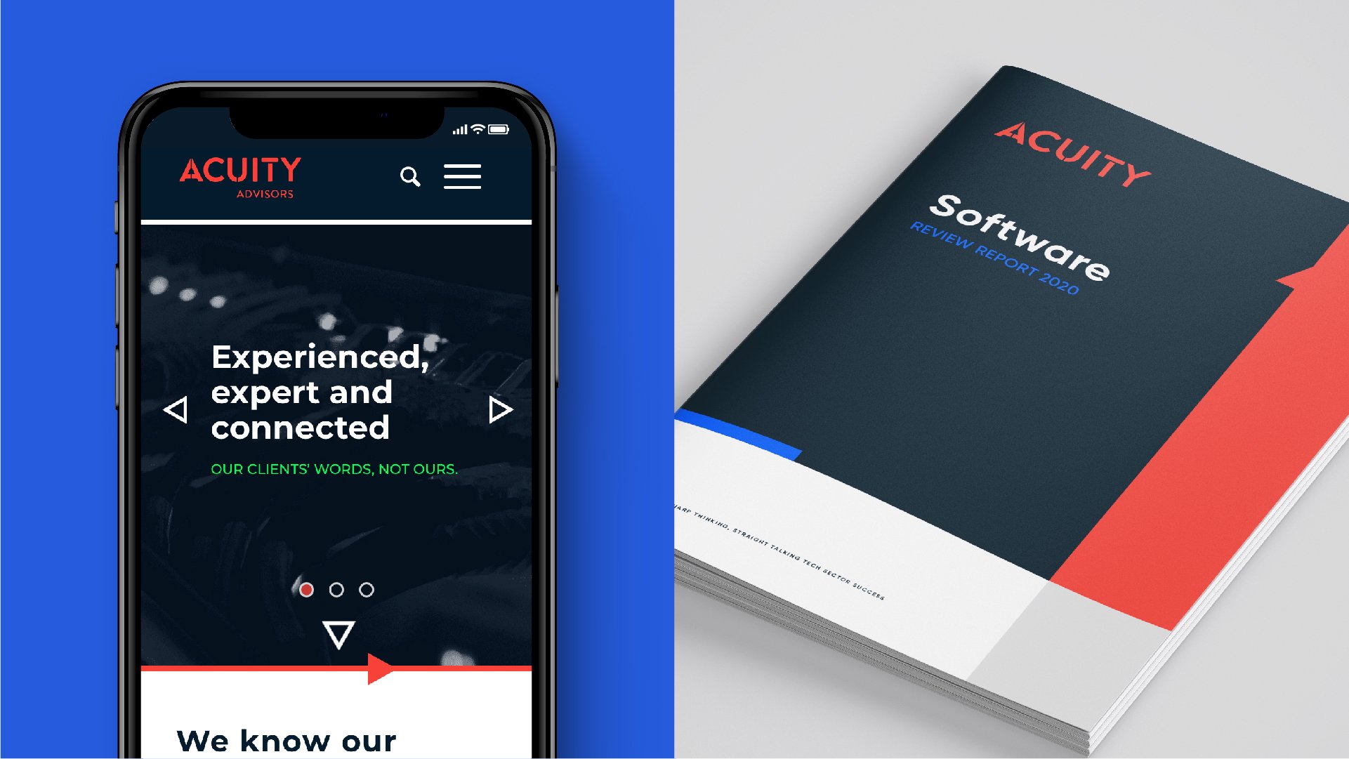
Acuity is a UK-based global mergers and acquisitions advisory specialising in the tech sector. That’s quite a mouthful, but really it’s a company of warm-hearted human beings who are highly passionate about what they do. We crafted a new identity for them to help reposition the brand as a serious player in the sector.
-
The beautifully considered ‘A’ icon, inspired by the idea of ‘mergers’ (two parties coming together), features a built-in amplifier component that references the brand’s tech roots. The wordmark is really a tiny electronic circuit board, complete with built-in amplifier.
The negative space in the wordmark creates an optical vibration; it feels a bit like a current is buzzing through the word.
The colour palette was inspired by deep tech hardware. The icon system borrows from transistors, capacitors and amplifiers. The primary font, Gilroy, brings a wonderful sophistication and humanity to the identity system through its rounded forms.