Matomani
Identity & Packaging Design
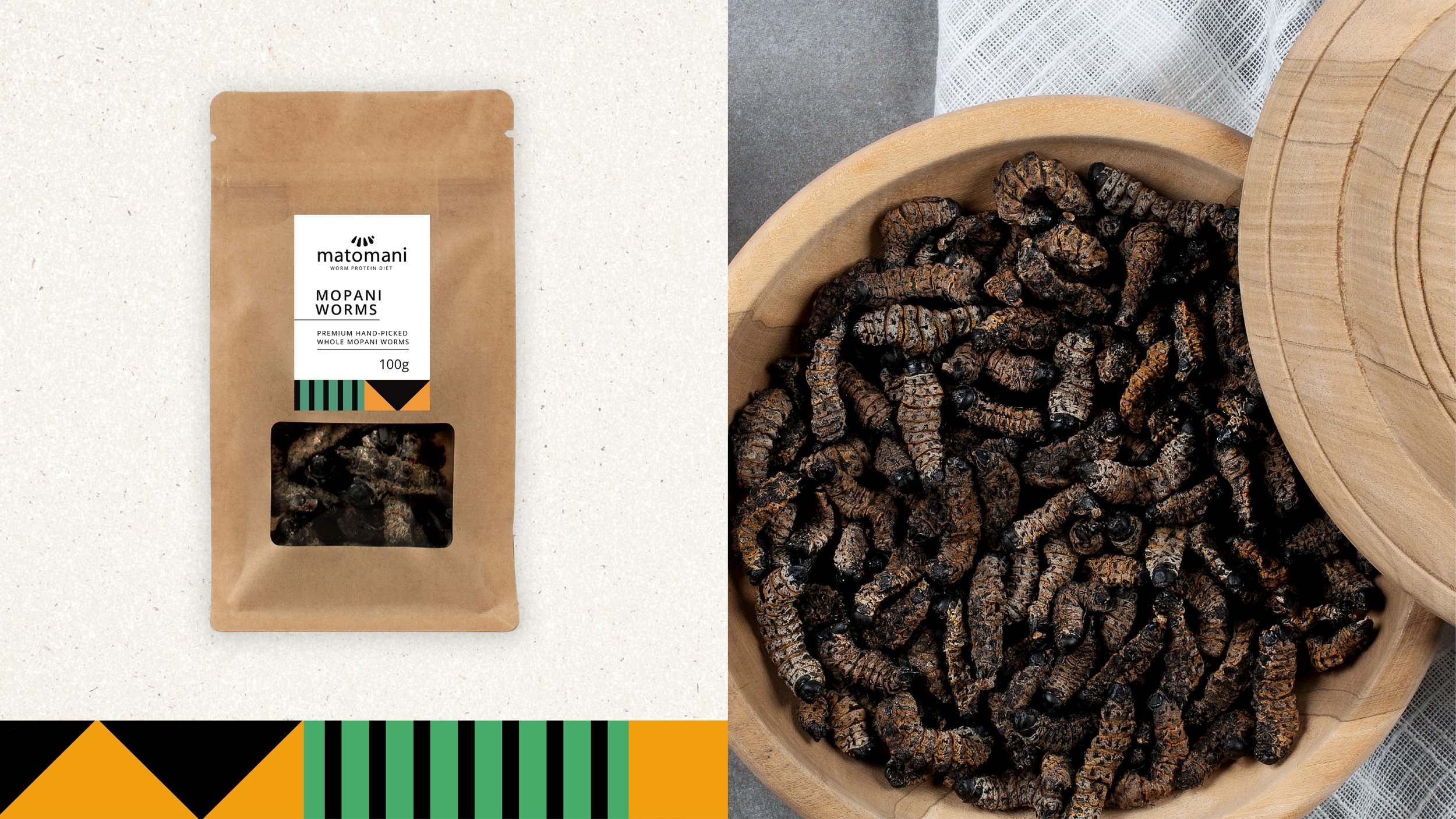
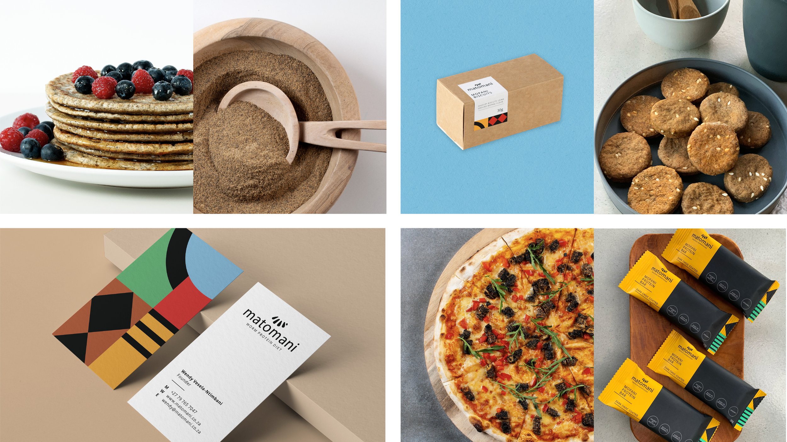
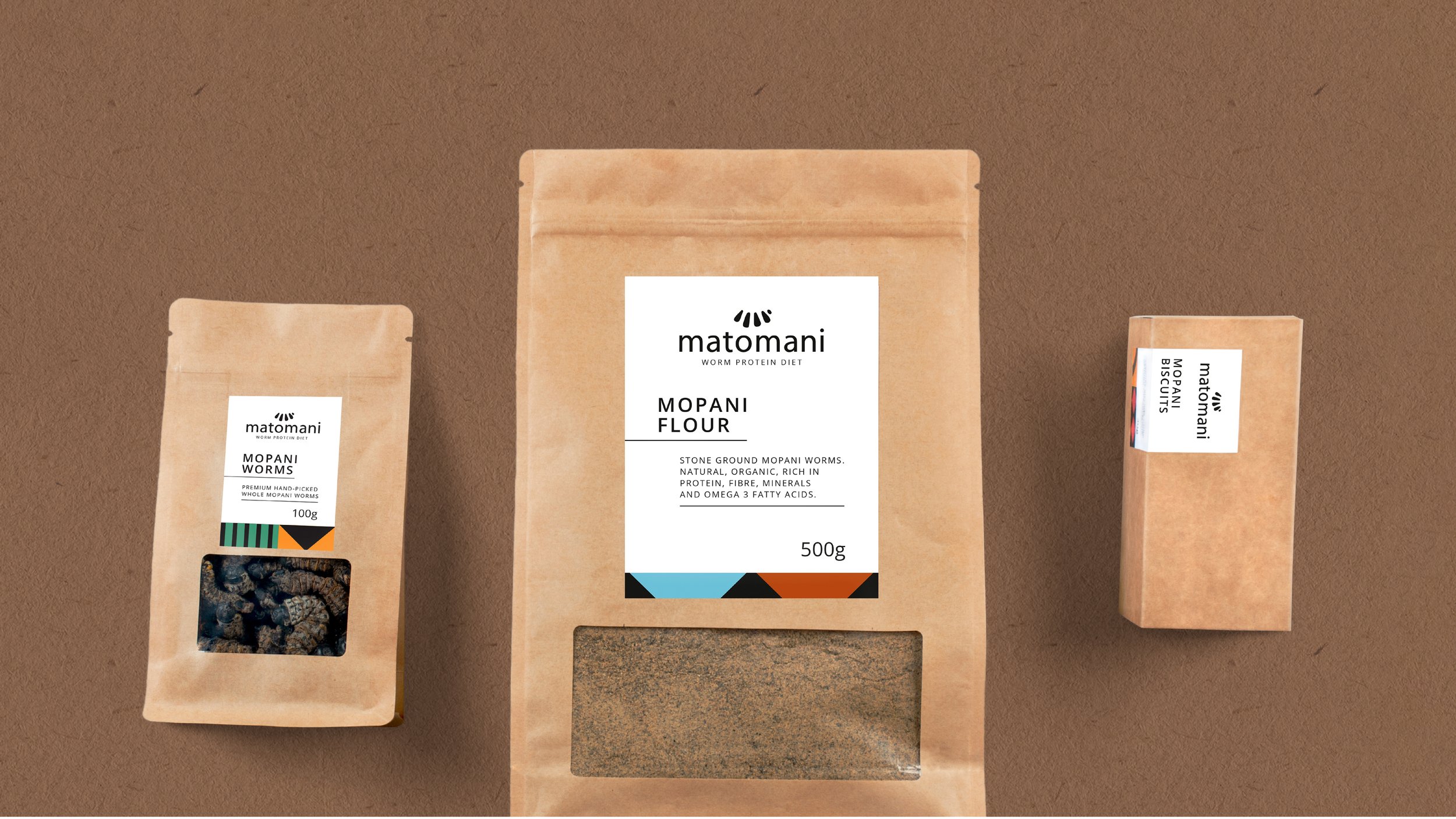
Matomani is a new take on Tsonga cuisine that mixes traditional and modern Mopani worm products and recipes. Positioned as premium, this protein-alternative brand needed an identity that celebrated its key ingredient.
Matomani’s products are healthy, natural, organic, sustainable and home-grown South African protein superfoods. The humble Mopani worm and XiTsonga motifs served as inspiration for the brand’s visual language. Vibrant colours and textures are expressed through graphics that honour and reference this traditional delicacy.


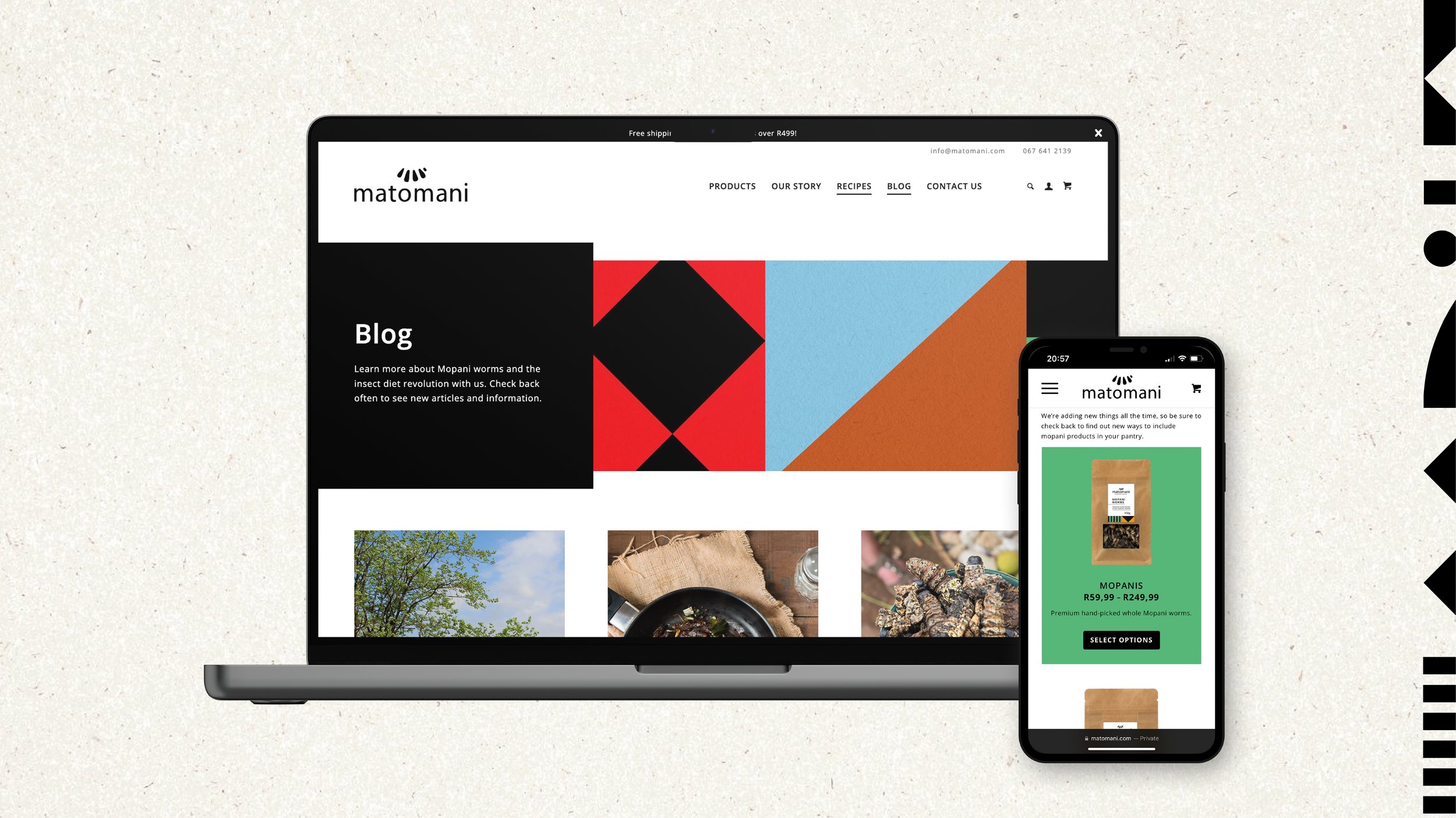
These energetic visuals then needed to be married with sophisticated design application. The end results combine healthy with premium, and cultural inspiration with global appeal.